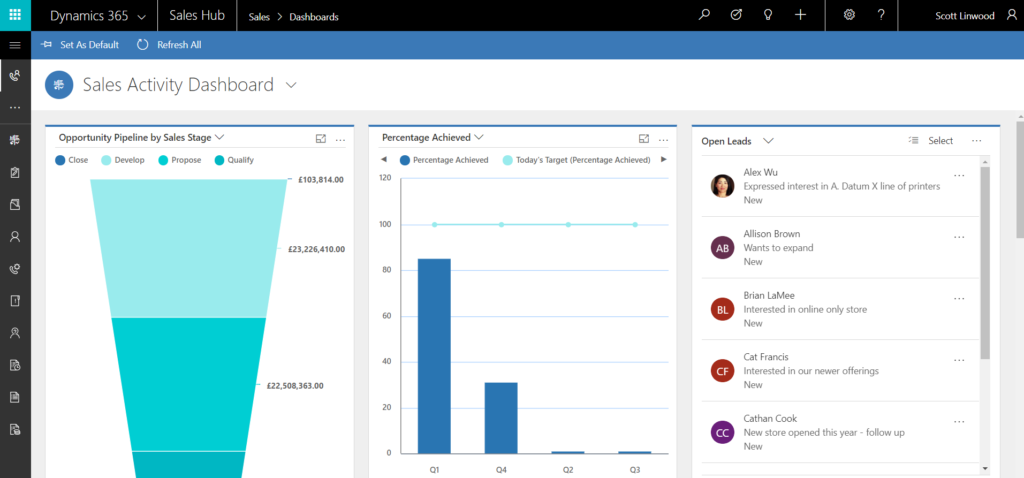
The new Microsoft Dynamics 365 Unified Interface may have gone unnoticed to some who have recently upgraded to version 9 of Dynamics 365. This is because as well as the spruced-up web interface that came with version 9, there are also new focused apps called ‘hubs’ that present users with a more significantly changed look and feel. The drive behind this change is the growing requirement to be able to have full access to your CRM wherever you go and whatever device you choose to use, be that a 40-inch 4k monitor or a 4-inch mobile phone.
There are some new features, some deprecations, and some temporarily absent features to be aware of as well as a difference in general navigation. As a result of this, we are holding back on switching everyone to the interface straight away, but are taking into account this preview of things to come. Nonetheless, it’s still a good idea to familiarise yourself with the interface since the mobile and Outlook apps, as well as the Marketing app, use it as standard now.
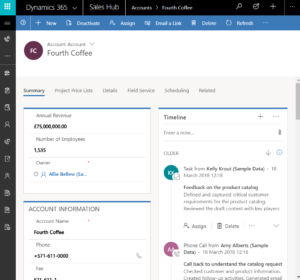
What you will notice straight away is that the top navigation bar has had some changes and the sitemap now peeps discreetly from the left. As viewports get wider, there is more space for side toolbars that display functionality in a friendly list. The ‘breadcrumb’ trail at the top is now solely for tracking back to places you have been rather than finding related records. This function now exists as a tab – a much-coveted functionality. One cascading column on entity forms has been replaced with tabs along the top of the page to click to whatever section you need.
The responsive design of the Dynamics 365 Unified Interface causes ‘reflow’ of elements on the page to scale to your viewport so that cut off, unreadable elements are not a problem. Labels wrap, and sections adjust their position. The look is unified over mobile and tablet clients, Outlook app and regular PC interface so that you can ‘learn it once and use it everywhere’. If the regular interface is sized small enough, you can view what you’d see on a mobile client on your monitor, saving space for whatever else you are working on with no need to keep maximising.
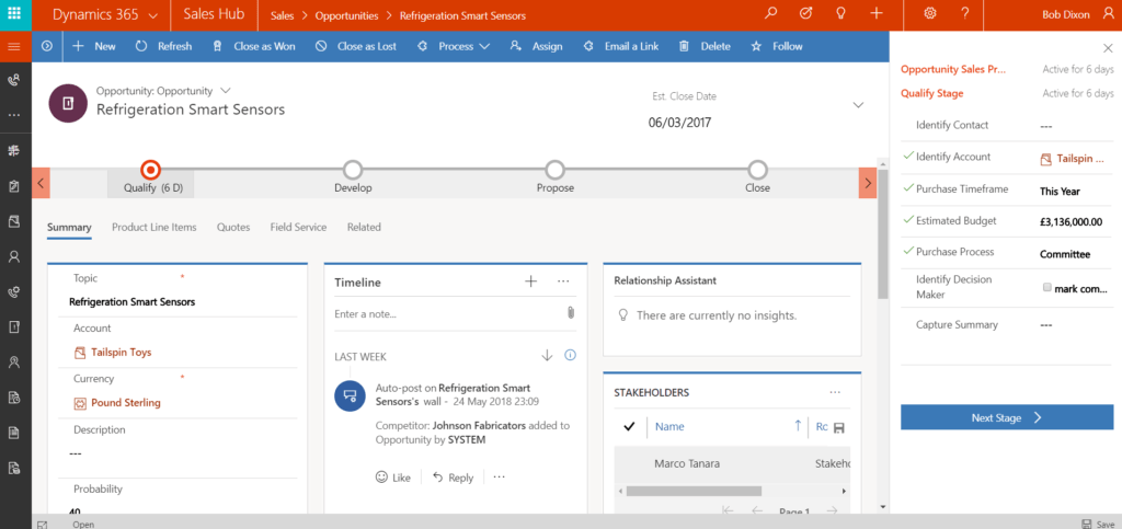
Business process flows are no longer open and green but are now orange and collapsed by default. Each stage can be dropped down as a to-do list, which can be docked to the right.
The social pane is now a chronological timeline of notes, posts, and all activity types. There are better filtering options to quickly find a particular activity. There is also a ‘what you missed’ notification that will flag recent activity that has occurred since the last time that you visited this record.
There are some new controls that can be added to forms too. There is the long awaited multi select option set fields that allow you to choose multiple values from a drop-down list. Reference panels can be used with all entities in the interface. The filtering and drilling down of interactive dashboards is now available on the mobile client and has similar controls that were previously only available on the Interactive Service Hub.
As for temporarily absent features, one of the most noticeable absences is advanced find. Bulk editing and deleting, running workflows and reports, learning paths, and campaign management are some of the other functions not yet present in the interface. We can’t confirm whether these (and others) are to not be present at all or are on the roadmap for the interface.
This consistent, accessible and responsively designed interface is an exciting step forward and doesn’t take long to grasp. Ultimately we suggest that admins consider the activities of their users and whether they would be able to utilise the new interface without restricting the user from functionality that they are used to. If a user relies on on-demand workflows in their role, for example, this interface will not be suited for them (yet).
To learn more about the new Microsoft Dynamics 365 Unified Interface, please get in touch.


